

Adventure awaits!
I had the pleasure of branding my friend Kristen’s bachelorette getaway. She wanted a set of logos that captured the simple, nostalgic appeal of summer camp and sisterhood.
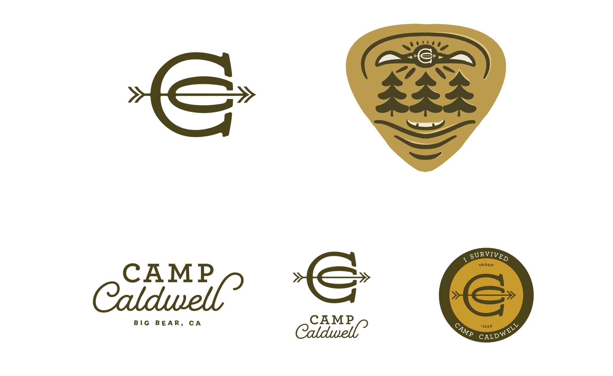
My first batch of logos leaned a little too clean and corporate. Great if we were seeking funding to launch our own camp, but quite not the right flavor for a party.

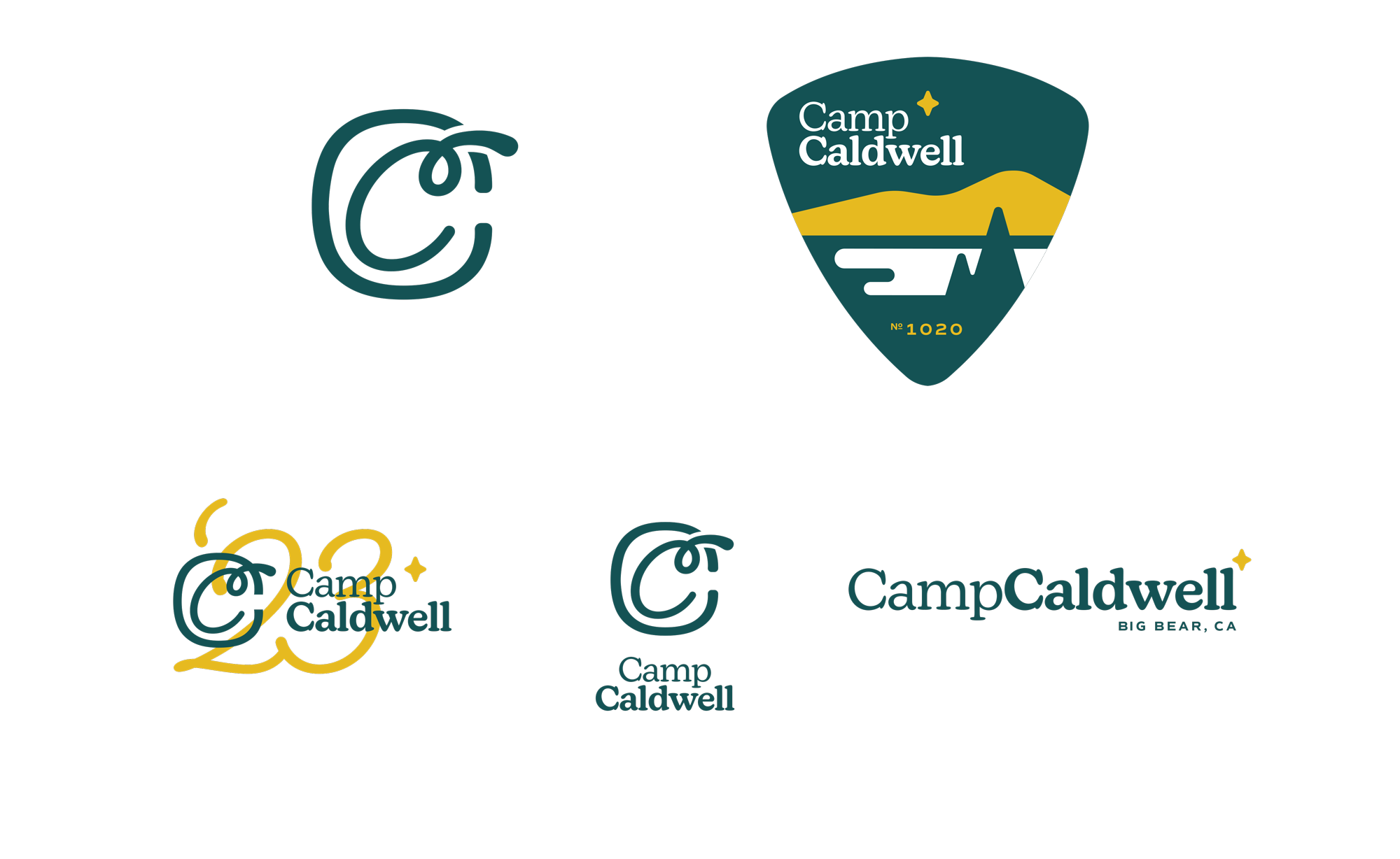
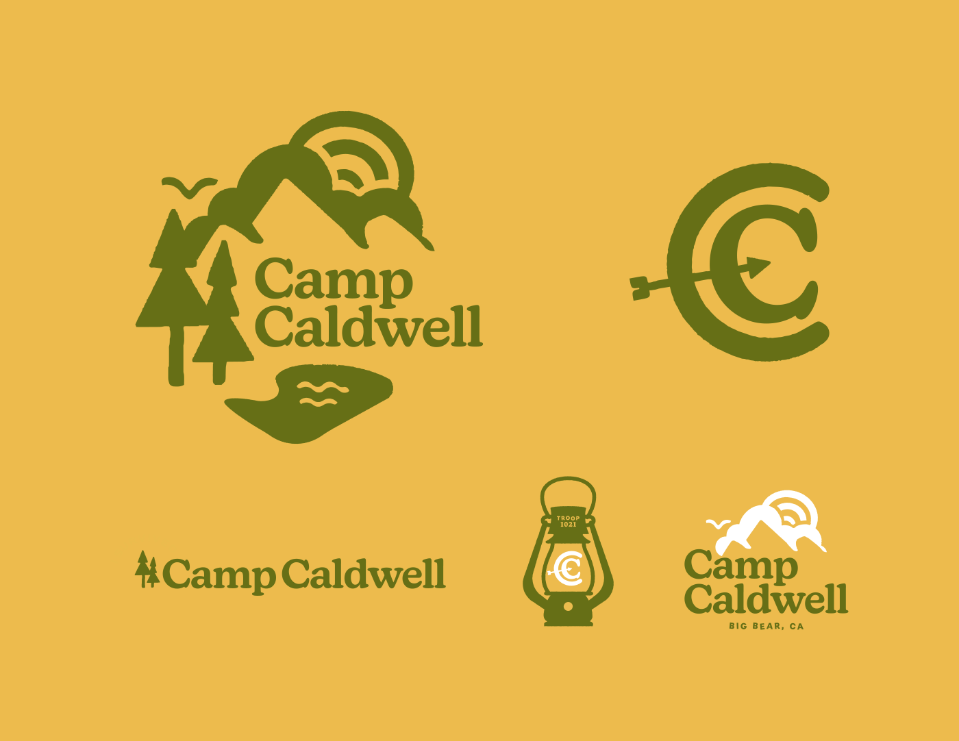
Final logo system
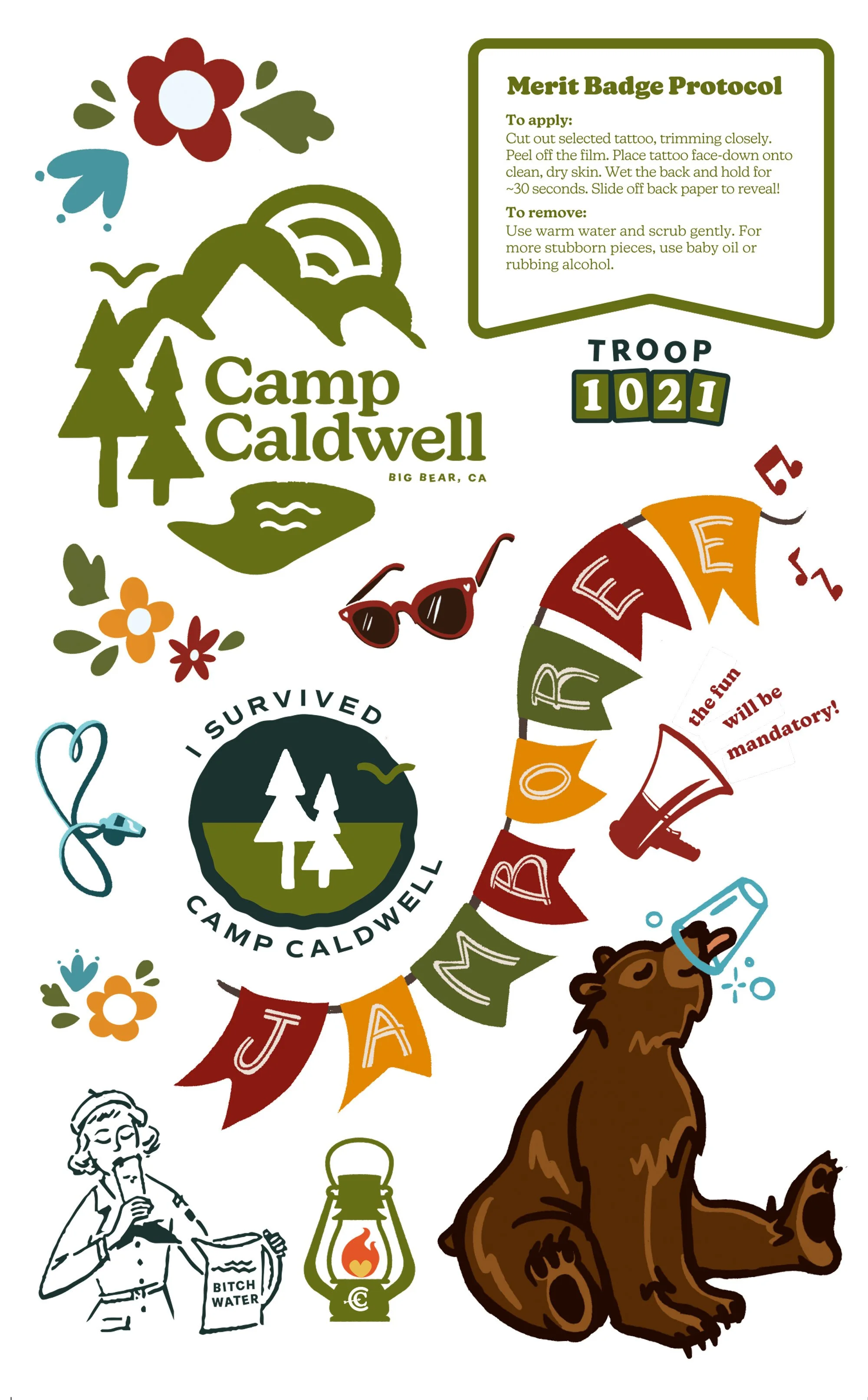
To capture more of the slapdash, sticky-fingered joy of summer camp crafts, I decided to simplify the typography and use heavier, iconic shapes that echo playful stencils, iron-on alphabets and sponge stamps.
We settled on a main lockup with a felty, safety-scissor styled landscape and a proud monogram with an arrow stuck slightly askew. I set the angle to 10.21° to match the wedding date.
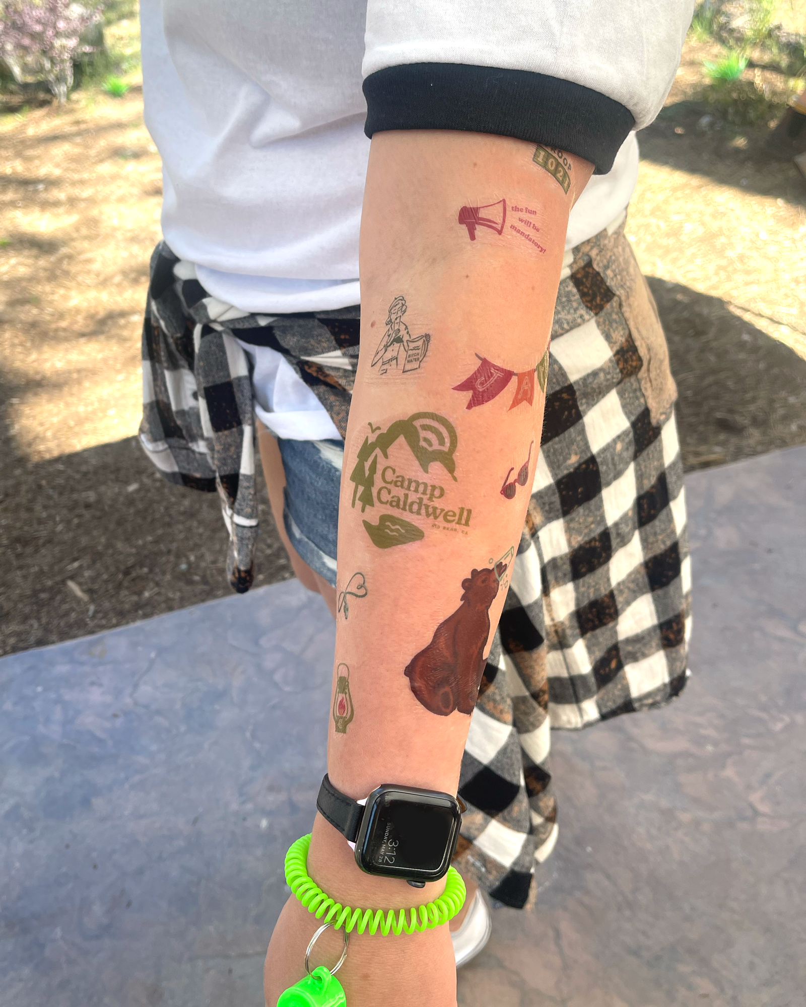
Tatts, too.
To truly tap back into the carefree vibes of childhood, I was also asked to create a set of temporary tattoos as favors. These featured elements from the branding system expanded to include carefree florals and further wilderness whimsy.